17 Mobile App Design Tools and Best Practices in 2025
The difference between a well-designed app and a poorly designed app is significant. High-quality app design is at the core of any successful app, laying the foundation for an app that’s smooth and easy to use.
There are a number of best practices to follow when designing an app, and a lot of tools to assist mobile app designers. This article will share all the tools you need to know, along with some best practices of mobile app design.
What is Mobile App Design, and Why is It Important?
Mobile app design is the process of planning and creating the visual and interactive elements of a mobile app. The goal is to create an app that’s attractive, intuitive, easy to use, and helps users get value out of the app.
Mobile app design needs to consider different device sizes, platforms and operating systems. If the app is a recreation of an existing website or web app (such as building an app for an ecommerce site), the app design needs to be consistent with the brand’s design and user experience on other platforms.
This is one of the most important parts of the app development process for a couple of reasons. First, because a well-designed app is vital for user retention and engagement. If users find an app confusing, hard to use or unattractive, they’ll be quick to uninstall it and find another option.
67% of app users will leave an app immediately if there are too many steps needed to find the information they want. In addition, the average 30 day retention rate for mobile apps (2.6% for Android apps, 4.3% for iOS apps) shows that users have no pause in finding another option if they’re not satisfied with an app.
The second reason mobile app design is important is that you need a clear plan before you move on to the actual development process. Mobile app developers are expensive, and you want to spend as little time on this process as possible, to keep costs down.
Poor or incomplete design requires developers to spend more time on the app, especially if you need them to go back and change things because you’re unhappy with the final result.
There are two stages to mobile app design, which we’ll expand on now: User Interface and User Experience.
UI (User Interface) Design
User Interface (UI) design focuses on the appearance of an app. The primary focus is to create an aesthetically appealing and easy-to-use interface that enables users to interact with the product effectively and efficiently.
User interfaces include components such as buttons, icons, typography, color schemes, menus, and layout, that together form the overall look and feel of the product. Good UI design not only enhances the visual appeal but also improves the usability and accessibility of the product, making it more intuitive and enjoyable for users.
UX (User Experience) Design
UX design focuses on how users interact with the app and how it can be improved to provide the best possible experience. The goal is to create a seamless, logical user flow.
UX design is a plan for how the app functions, how users find specific features, how easy it is to find and perform common user tasks, and how it matches a user’s expectations for what should happen when they interact with a specific element or feature.
UX and UI design are two distinct skills - a design team will likely have different people handling UI and UX. But it's important these designers work together, to ensure both aspects complement one another.
Is There Any Difference Between Android App Design and iOS App Design?
Designing apps for Android and iOS devices is quite similar. Both require a user-friendly interface, and logical navigation and usability. However, you may need to consider some small differences between the two platforms.
Android apps tend to have more options available on the screen at any given time than iOS apps do, and they also support different screen sizes. Additionally, the aesthetic style and color palette used in Android apps typically differs from that of iOS apps.
There’s a little more flexibility with what you can do on Android versus on iOS. Apple users, in general, prefer a cleaner and sleeker design.
Having said that, it's best not to change your design too much between different platforms. Outside of differences required per OS design guidelines, it's better to put out a consistent UI and UX across all platforms you're on (including the mobile design of your website).
The App Design Process
Now let’s look at how the process typically works for designing an app.
For large-scale projects, app design might start with user research, to understand what resonates with your target audience and ideal users. This can include surveys, interviews, and testing, to get valuable ideas based off user feedback.
From here, you can start with a rough sketch of the UI. This is followed by wireframing, mockups, and eventually storyboarding.
Let’s look a little closer at these steps.
Wireframing
One of the first steps in mobile app design is creating wireframes.
Wireframes are basically digital sketches, which just show the basic structure and layout of your app screens.
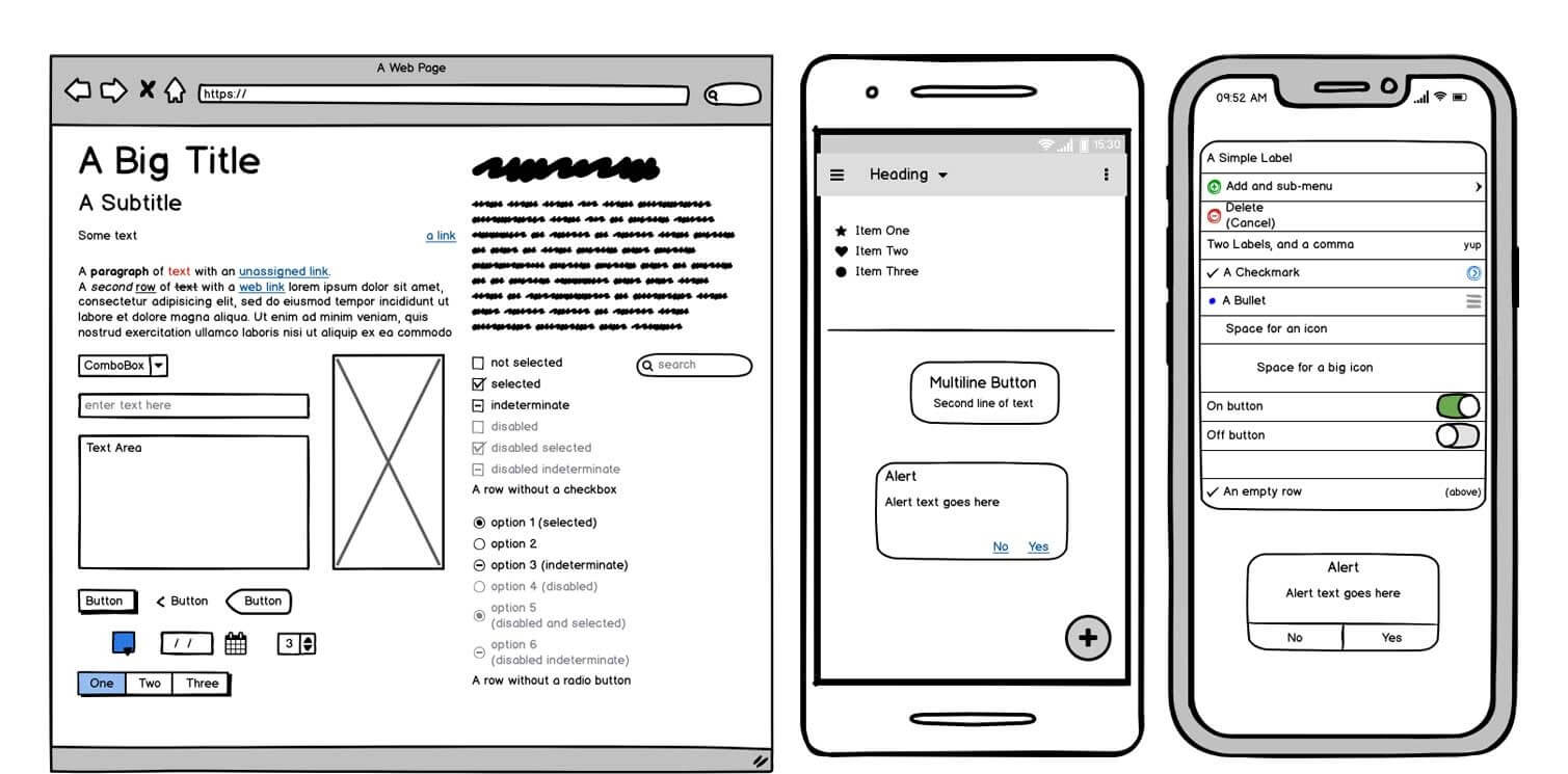
Wireframing allows you to create a rough plan for your UI without going too in-depth into visual design. This helps identify potential issues early on, allowing room to quickly adjust plans and make necessary changes before moving ahead with development.
A wireframe includes details such as user interface elements, navigation structure, and content placement. The point is to map out the user journey and plan the app layout in as little effort and investment as possible.
Mockups
You can move forward with wireframes alone, or go one step further and create a mockup. A mockup is a more detailed version of a wireframe, which may include more interactivity, as well as colors and more detailed visuals (e.g. images, typography).
You can do app mockups in many popular design tools (some of which we’ll discuss below), or even go so far as to build a functioning and interactive mockup in a no-code app builder.
Storyboards
Generally, after creating wireframes and/or mockups, you’ll create a storyboard. This plots out how someone uses the app, screen by screen. It shows how the user journey flows from one screen to the next, what happens when users interact with various features and elements, and what happens with an incorrect user input (e.g. filling a form wrong).
This is where you really weed out and solve any issues with mobile usability.
A comprehensive storyboard lets you be comfortable that your app will provide a logical and intuitive flow, and that users won't get stuck or confused anywhere.
Be sure to take your time and consider all edge cases, and different ways users might interact with your app. Consider what will happen when you send push notifications or in-app notifications, when someone logs in, when someone's subscription fails/expires, etc.
This will ensure you don't need to go back and rebuild after shipping the first version of your app.
App Design Best Practices
There are a number of best practices you can take into consideration when designing an app. The best app designers follow these best practices to create apps that are visually appealing, with an intuitive flow and user experience.
While there is a lot more than goes into app design, these tips will help you avoid a lot of the pitfalls of poorly designed apps.
Clarity and Simplicity
More than anything, an app should be clean, clear and easy to figure out. You don’t want any confusion or excess clutter in your UI.
Keep the interface clean and straightforward, avoiding unnecessary UI elements and complexity. Prioritize ease of use by ensuring that users can quickly understand and navigate the app.
You want each mobile screen to minimize the user's memory load - don't make them think, don't make them draw from memory when they need to find something or take an action. Things like navigation, back buttons etc should be where users expect.
It should be easy and obvious for users to get to the next logical step in the user journey.
Consistency
Maintain a consistent design language throughout the app, including typography, colors, icons, and interaction patterns. Consistency helps users feel familiar with the app and minimizes the learning curve.
Nothing appears more unprofessional, and loses your user’s trust faster, than inconsistency from one app screen to another.
It’s also important to consider consistency between your app design and your design and branding on other platforms, such as on the web. Keep this consistent to deliver a clear and coherent brand image at every touch point.
Visual Weight and Hierarchy
Visual weight and hierarchy are essential parts of a good visual design. They show where the user’s attention is supposed to be drawn, and thus create an organized and coherent flow.
Visual weight is the degree to which an element stands out on a given page, based on size, color, and font weight. Hierarchy refers to the order in which elements appear and how they relate to each other.
Your UI should draw attention to important elements while deemphasizing secondary or tertiary features. This makes it easy for the user to understand the order in which they should follow each element on a screen, and which elements are related to each other (such as a piece of text belonging to a certain heading).
Responsiveness
Responsiveness, in mobile app terms, can refer to both how an app works on various devices, and the speed at which it functions.
You want your app design to work great on a range of different screen sizes and device orientations, providing an optimal experience for all users, regardless of their device. Whether your user has an iPhone 14, Samsung Galaxy s21, Galaxy Z Fold3, Xiaomi Redmi Note 11, OnePlus 10 Pro, your app should be flexible enough to look perfect on all devices.
The same thing goes for orientation - users should be able to use the app effectively whether it’s in portrait or landscape mode.
In addition, it should be fast. App users are quick to discard an app if it’s too slow to load. Part of that comes down to the developers, but you can also influence this at the design stage. Don’t squeeze too many interactive elements on one screen, and don’t make users wait for content.
Design for Touch Screens
The biggest difference between UI & UX design for mobile apps, versus the same for websites, is having to consider touch screens.
Designing for touch will help you reduce the number of incorrect inputs and make interaction with an app more comfortable. Designers should consider the size and spacing of buttons and elements in order to facilitate accurate touches and eliminate any false clicks.
Here’s an interesting nugget - among app users aged 18-34, 61% want to be able to use apps with only one hand. Consider that when deciding where to put interactive elements, as you might be losing users if you make these elements hard to reach.
Feedback and Error Handling
Another key part of effective mobile app design is how the app responds to user input.
You want to give users immediate feedback on their interactions, such as visual cues or sounds. Make it clear when they’ve hit an interactive element. Offer clear and helpful error messages, guiding users towards resolving any issues they may encounter.
This drastically reduces the amount of frustration users experience with your app, helping stop them from giving up and switching to another app.
Prioritize Usability and Accessibility
The focus should always be to create an app that is easy to use for a wide range of users.
You’ll get higher satisfaction, engagement and retention rates the wider the base of users you’re able to cater to.
You want to make it easy to learn how to use your app, no matter the user’s age, experience or education level. It should also be usable and engaging for individuals with various disabilities, such as including visual, auditory, cognitive, and motor impairments.
Consider aspects such as color contrast, font size, and touch target size to create an inclusive experience in your app.
Mobile App Design Tools
The right tool set makes designing an app so much easier. These tools help with wireframing and mockups, and using drag-and-drop functionality to design and iterate on your designs quickly and easily.
Here are some of the most popular mobile app design tools with industry professionals today.
Balsamiq
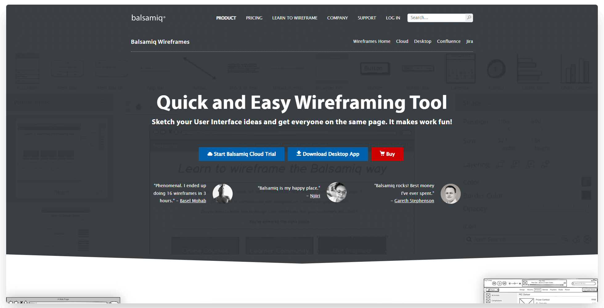
Balsamiq is one of the top wireframing tools on the market, and has been for many years.
It’s one of the most intuitive and easiest to use design tools out there, which is why it’s so popular. You can’t create extensive, pixel-perfect designs like with some of the other tools we’ll mention in this list, but for simple, fast wireframes it’s the best.
You can use it as a desktop app or cloud software. It enables collaboration, as well as exporting wireframes as a PNG or PDF for handing off to developers or iterating with your team.
A nice extra about Balsamiq is their collection of educational resources, which offers a lot of free value in learning about wireframing, UX and UI design.
Sketch
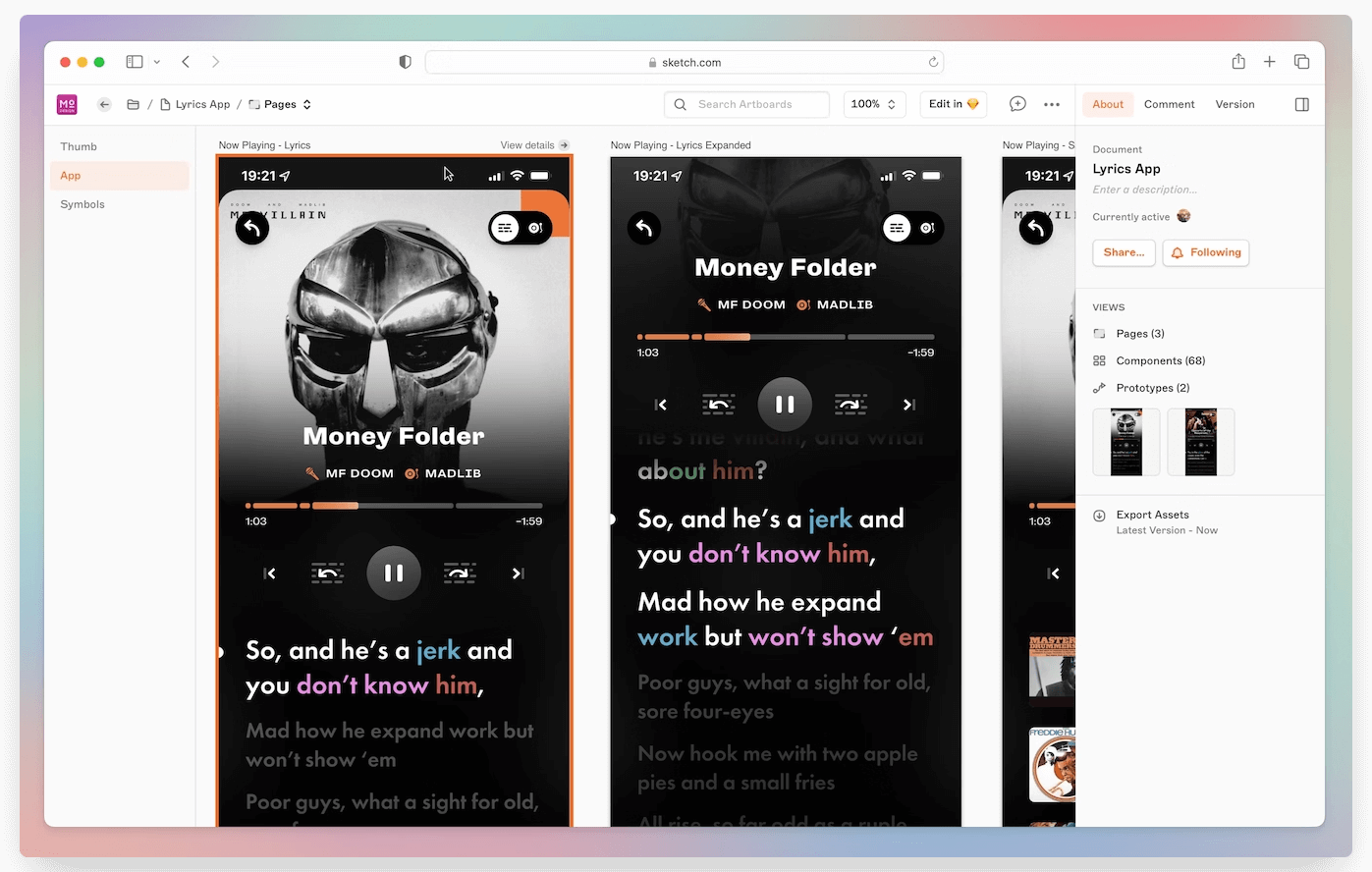
Sketch is one of the most popular mobile app design tools available today. It’s a Mac app that’s widely used by UI/UX designers in a wide range of industries, including the mobile app space.
It’s got everything you need to plan and design every pixel of your app including individual screens, elements, icons and more. It enables prototyping, as well as real-time collaboration.
It’s a complete design platform, which has all the features necessary to create a thorough design you can hand off to developers to start coding.
Figma
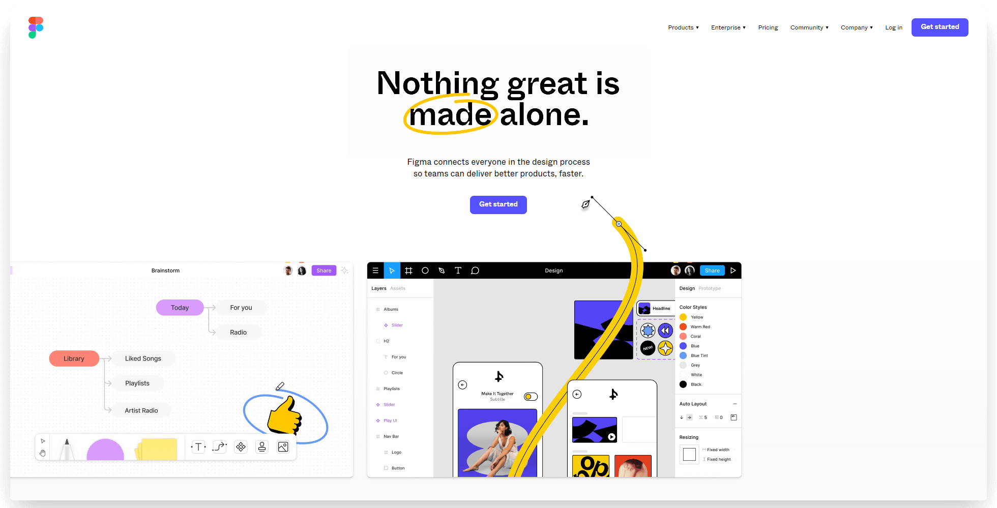
Figma does much the same things that Sketch does. It’s a deep and flexible design tool, able to create everything from simple wireframes to more complex app mockups.
The big difference between the two is that Sketch is a local design software, which you have to download (and can only be used on Mac). Figma, on the other hand, works in your browser, and can be used on any operating system.
As a newer player, it doesn’t have quite as deep a feature set as Sketch. However, you might prefer Figma if you want a browser-based design tool that’s accessible on both Mac and Windows.
Adobe Experience Design (XD)
Adobe Experience Design (XD) is another powerful app design software offering a range of features for creating wireframes, prototypes, and other visuals for mobile apps.
Adobe XD is a desktop application, like Sketch. Unlike Sketch, it works on both Mac and PC.
As far as the functionality and design tools offered by Adobe XD go, they’re very similar to Sketch and Figma. The user interface is similar too.
Ultimately, choosing between these tools comes down to user preference. Pick the one you feel most comfortable with, and use that as your mobile app design hub.
Origami Studio
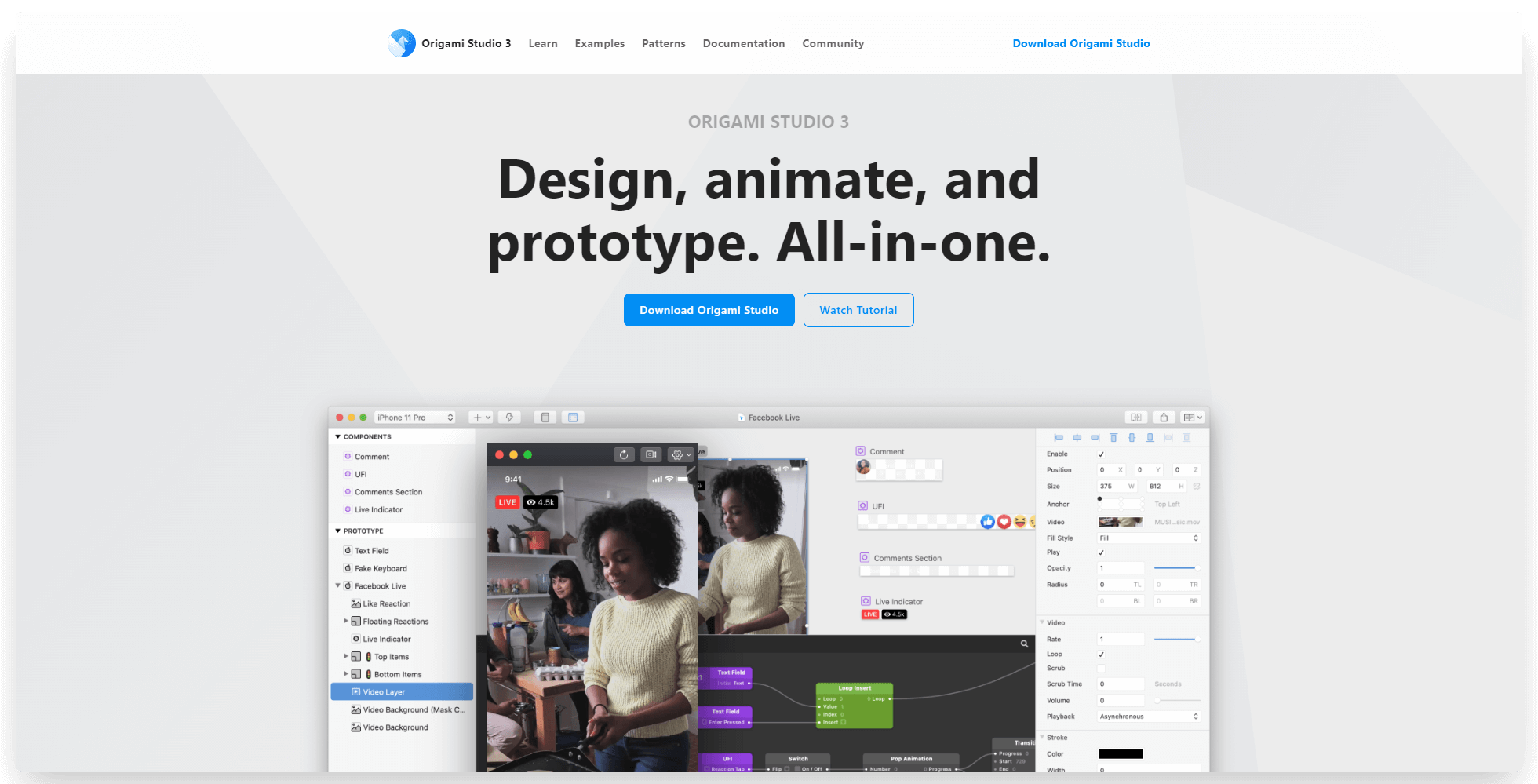
Want to design apps the way Meta does? Origami is the tool to do it.
Origami Studio is an intuitive and powerful app design tool for creating visual designs, animations and prototypes of your mobile apps.
This software was developed by Facebook engineers, and was used to design apps like Messenger and Instagram. It allows you to quickly bring your designs to life with its library of pre-built components and drag-and-drop interface. It also enables user testing through a live preview of both iOS and Android versions of your app in Origami.
Origami is free, which is nice. However, for the majority of your design, you may find the likes of Sketch, Figma and Adobe XD easier to use, even if you need to pay for them. But if you want to build out more interactive prototypes and higher-end visuals, Origami is the perfect tool.
InVision
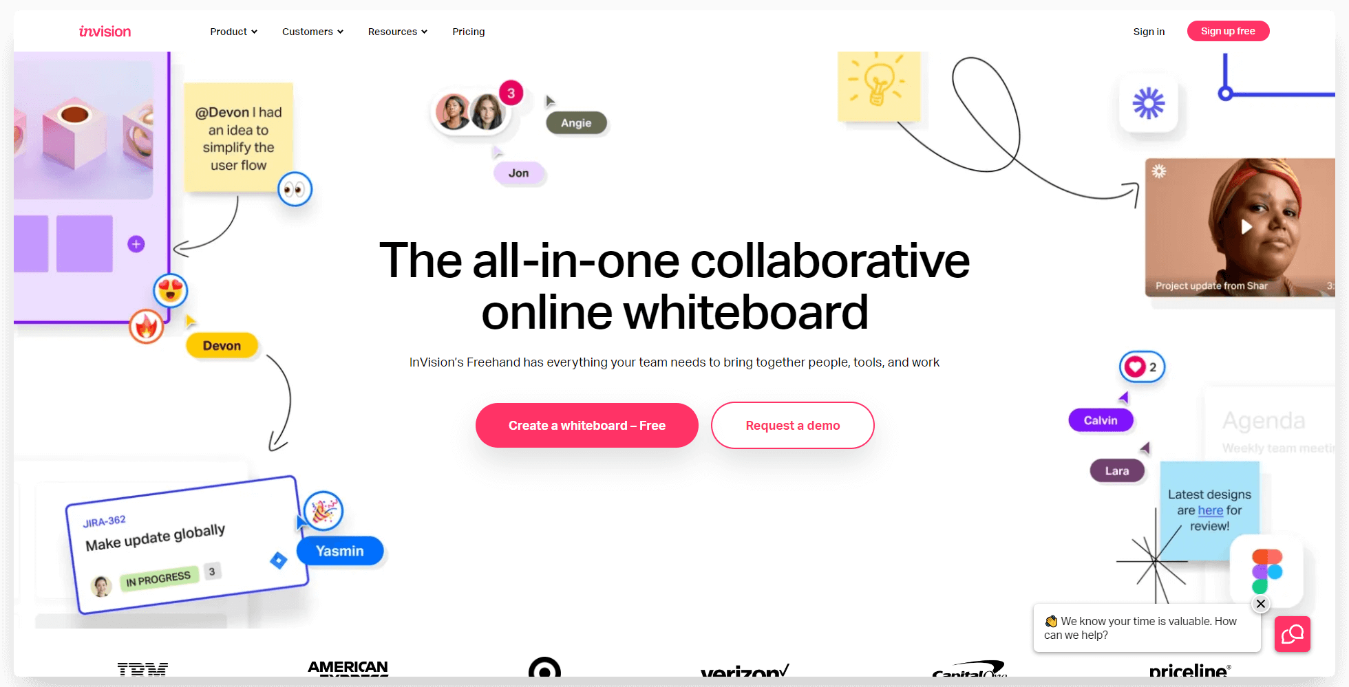
InVision is a tool for high-level planning and collaboration in the design process.
It’s geared towards design teams, or teams that require extensive back-and-forths between design and other areas of the business. You can use it for brainstorming, collaborating on specific parts of the design process, as well as using it as a central hub for a project.
It also allows you to bring in your designs from tools like Sketch or Figma and get input from your team, before passing it on to development or going back and making further iterations.
You don't need InVision if you’re a lone wolf designing your own app, but it’s a great productivity and collaboration tool for larger teams.
Photoshop
Photoshop doesn’t need much introduction. It’s a mark of a software's success when its name becomes a verb (“photoshopped”).
It’s a tried and true design tool, offering complex photo editing features, as well as the tools for designers to create impressive graphics, animations and more.
Photoshop is not traditionally considered a go-to tool for mobile design. Tools like Figma and Sketch are better suited as mobile app design tools because of how easy they make it to convert your designs to code. But if you need to create unique images or animations for your app (i.e. design elements like logos and splash screens), Photoshop can be a great asset.
Iconjar
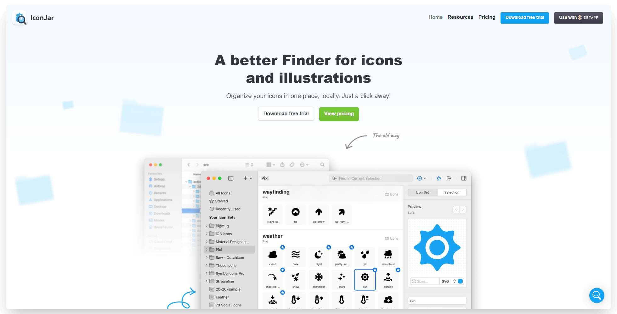
One of the more time-consuming and underlooked areas of app design is dealing with icons. You’ll need to use a lot of icons in a lot of different places in your app - and it’s vital that these stay consistent, and it’s easy to find which icons you use when you need them.
Iconjar is a way to organize your icons in one place. You can store all the icons you use, in various sizes and colors, and have them ready whenever you need to create a new screen or element and need the exact same icon you used somewhere else.
It doesn’t seem like much, but a tool like this will save you a ton of time and help you create a consistent and professional app design.
UI Stencil Kit
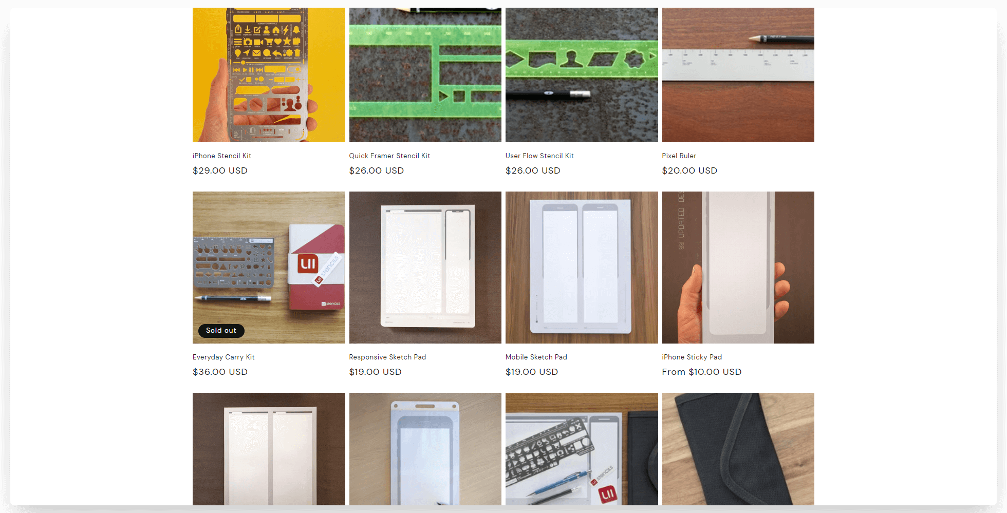
Something a little different to the rest of this list. UI Stencil Kit isn’t a software tool - but it has some extremely useful tools for mobile app designers who want to do their initial plan on paper, instead of on a computer.
This company offers stencils, sketch pads and accessories for designers (specifically app designers). These include stencils for commonly used app icons, as well as sketch pads with device/browser silhouettes.
Starting with a sketch is a very flexible way to start out and iterate through a number of different design ideas quickly. If you work best this way, these products are a great fit.
MobiLoud
Finally, we’ll mention how MobiLoud helps you design and launch beautiful mobile apps.
MobiLoud is a software tool (and a service) that allows website owners to convert their site into like-native mobile apps.
It does essentially everything you need in terms of mobile app design, if you’re building an app for your website. There’s no need to create wireframes or prototypes and spend painstaking hours ensuring everything is consistent across web, Android and iOS. MobiLoud does all that for you, quickly creating apps for each platform, completely synced with a consistent UI and UX across each.
The few things that you need to add to your UI for the apps (such as native navigation, menus, loading indicators etc) are done for you. You can configure these in the MobiLoud builder, and the MobiLoud team will handle all the coding needed to bring it to life.
MobiLoud also offers a full-service option, which handles all the app design for you, without you lifting a finger.
Learn more about how MobiLoud works here. If you’re in the process of designing an app for your website and want to see how MobiLoud makes it easier, click here for a free, personalized demo to get a preview of your app and see how everything works.
The Best Way to Design Apps in 2023
App design is where you flesh out your app idea into something that's usable, functional and attractive.
It’s important to put a lot of thought and effort into the app design process. You want to get your UI and UX perfect at this step, before paying developers to create your app, only to have to go back and make changes while still paying their high hourly rates.
This applies if you’re building an app from scratch. However, if you’re using another platform as a starting point (like a web app or a website), you can skip much of the app design process.
Your web app should already look and work great on mobile, since rising mobile usage rates mean a large share of your visitors will likely come on mobile devices. When it comes to designing and creating an app, you can simply reuse the same design, with a few small tweaks to your existing UI.
That’s why MobiLoud is so powerful. By converting your website into a mobile app, you don’t need to spend days or weeks on design (that’s not to mention how much you save by not having to hire developers).
It’s also much cheaper and easier to make changes to your design after launching, as you can simply edit this on your website. Your app will update automatically, and you don’t need to pay developers to make any tweaks or updates.
This is how most high-end businesses are managing multiple platforms (Android, iOS and web) today. It’s just not worth the effort to design, build and manage individual platforms separately when such a simple solution exists.
Want to learn more? Get started with a free preview of your app, or schedule a free, personalized demo and get a first-hand look at the platform's possibilities with one of our app experts.
Convert your website into a mobile app




.webp)

